
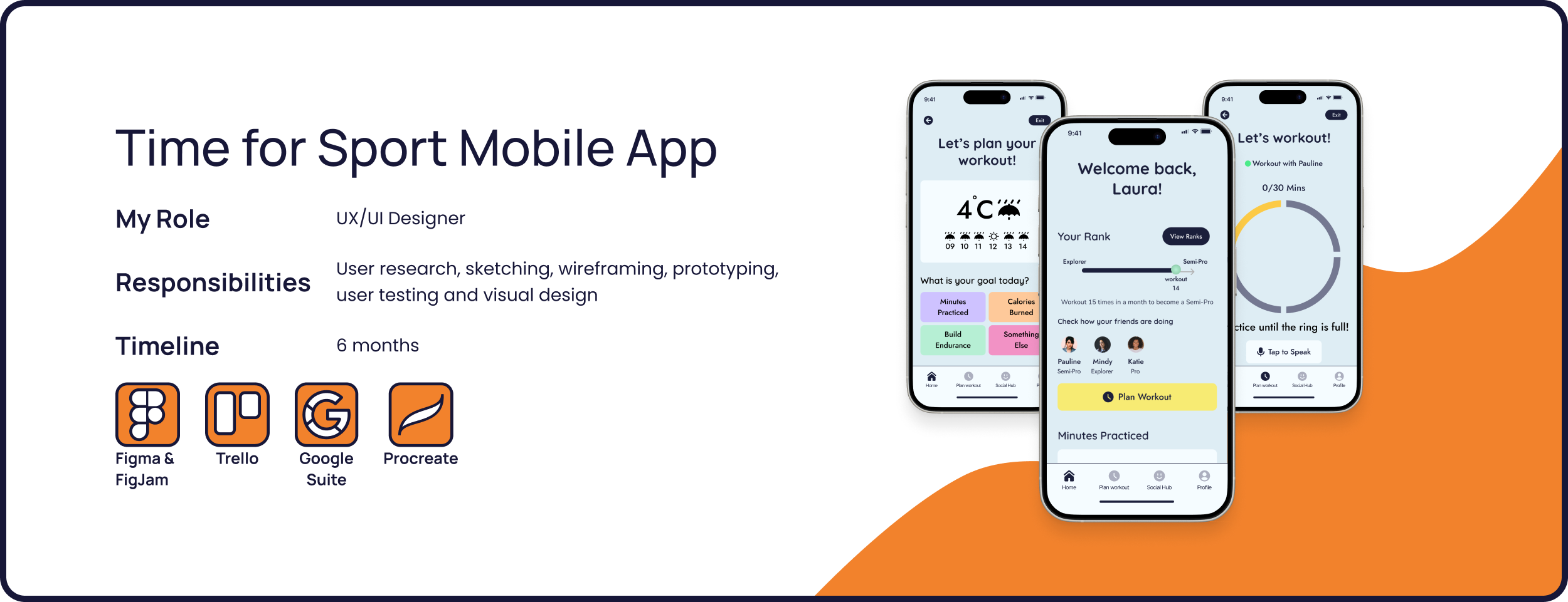
Project Overview
Time for Sport is an end-to-end user-centric app designed to help women integrate sport more easily in their day-to-day lives.

Project goal
Designing an end-to-end app to help users practice sports consistently.
Users
Women who want to integrate sport more easily into their daily lifestyle
Users problem
Users struggle to stay consistent with practicing sports while facing multiple hindering factors that are not addressed unitarily by a single app.
Business Goal
Differentiate from single-feature competitors by offering an all-in-one platform for consistent, enjoyable sport.
Solution
An all-in-one mobile app focused on helping women practice sports consistently by offering scheduling tools, weather-linked suggestions, and the opportunity to practice together within a social hub.
For the extensive documentation of my process, check my Medium article here.
Define
Gathering multi-faceted insights with a complete Research Methodology
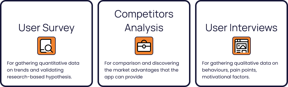
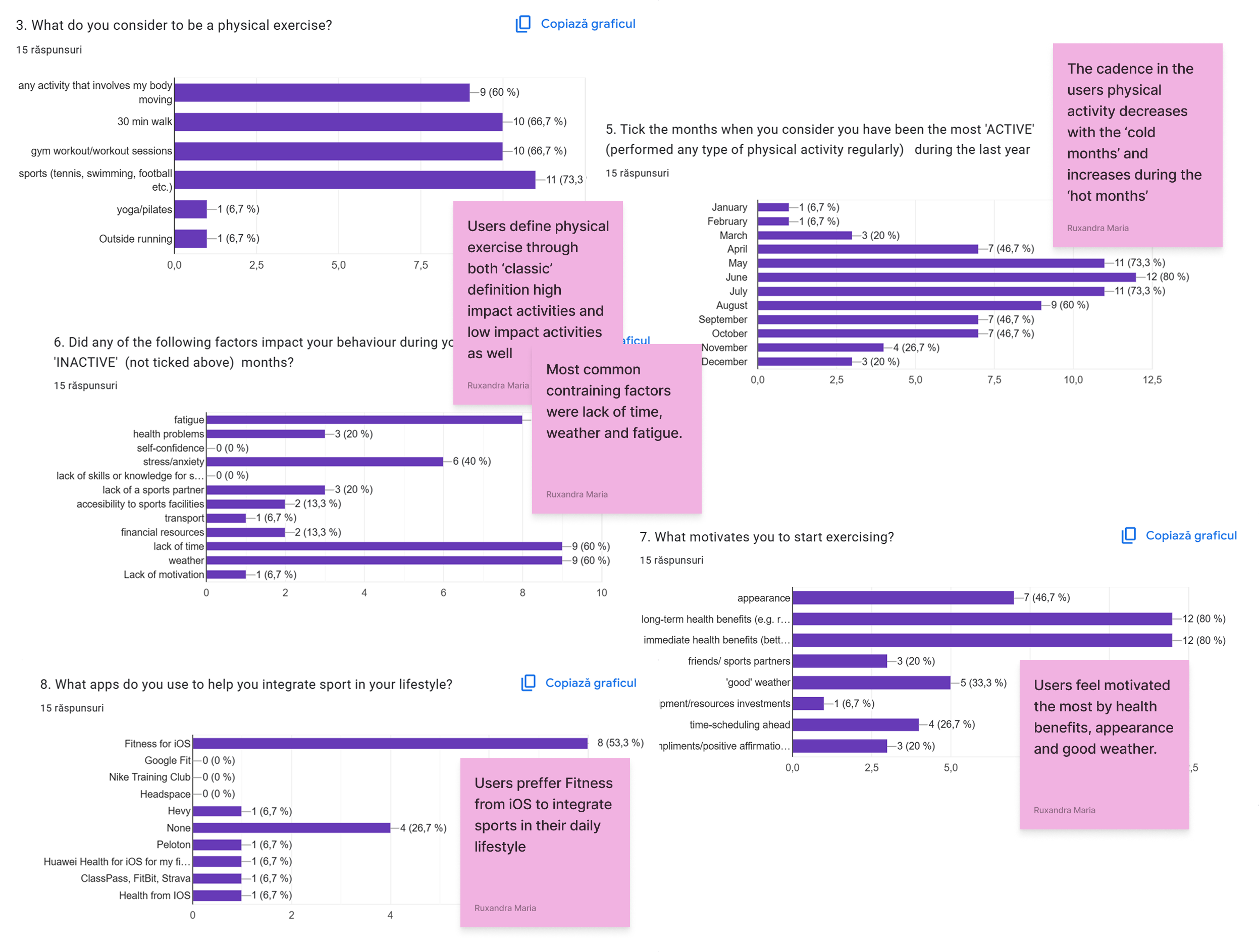
Tracing the first insights with the data collected in the User Survey
Learning how to distinguish from the Competitors
Based on the data collected in the User Survey, I have discovered that users use Fitness for iOS, FitBit, Hevy, Class Pass, Strava, Peloton, Health for iOS, and Huawei Health to help them integrate sports into their daily lifestyle.
Therefore, I have composed a Competitive Market Analysis focused on the above-mentioned apps.

Understanding the user’s needs through User Interviews
Users interviewed: 5
Purpose: understanding how and why users change their behaviours throughout the year regarding physical activity, but also what would help them.
Scenarios: practicing sports consistently | having a break in physical activity | having the possibility to change anything to help them keep consistency

Highlights from the Users’ Answers

Define
Using the insights to construct a User Archetype representing the preferences, needs and behaviors of the UsersDefine

Thinking What the Seasonal Exerciser needs and why through POV Statements

Understanding How Might We help the Seasonal Exerciser

Ideate
Pushing for creativity through Brainstorming, Crazy 8s. Expanding the ideas with the Lotus Blossom technique
Empathising through Storyboarding:
How will the Seasonal Exerciser use the app to overcome hindering factors and practice sports?

Creating the composition of the app through a Sitemap
With the Social Hub and Schedule Panel in mind as the main focus features, I created the sitemap of the app. The composition was designed as a personalised experience to help the seasonal exerciser overcome the personal hindering factors they are experiencing and establish their own goals to motivate them.
Composition characteristics:
account-based system
progress tracking
monthly and daily goals set-up
friends interaction

Implement
Visualising the composition of the app through hand-drawn sketches

Transforming ideas into screens: Mid-Fidelity Wireframes
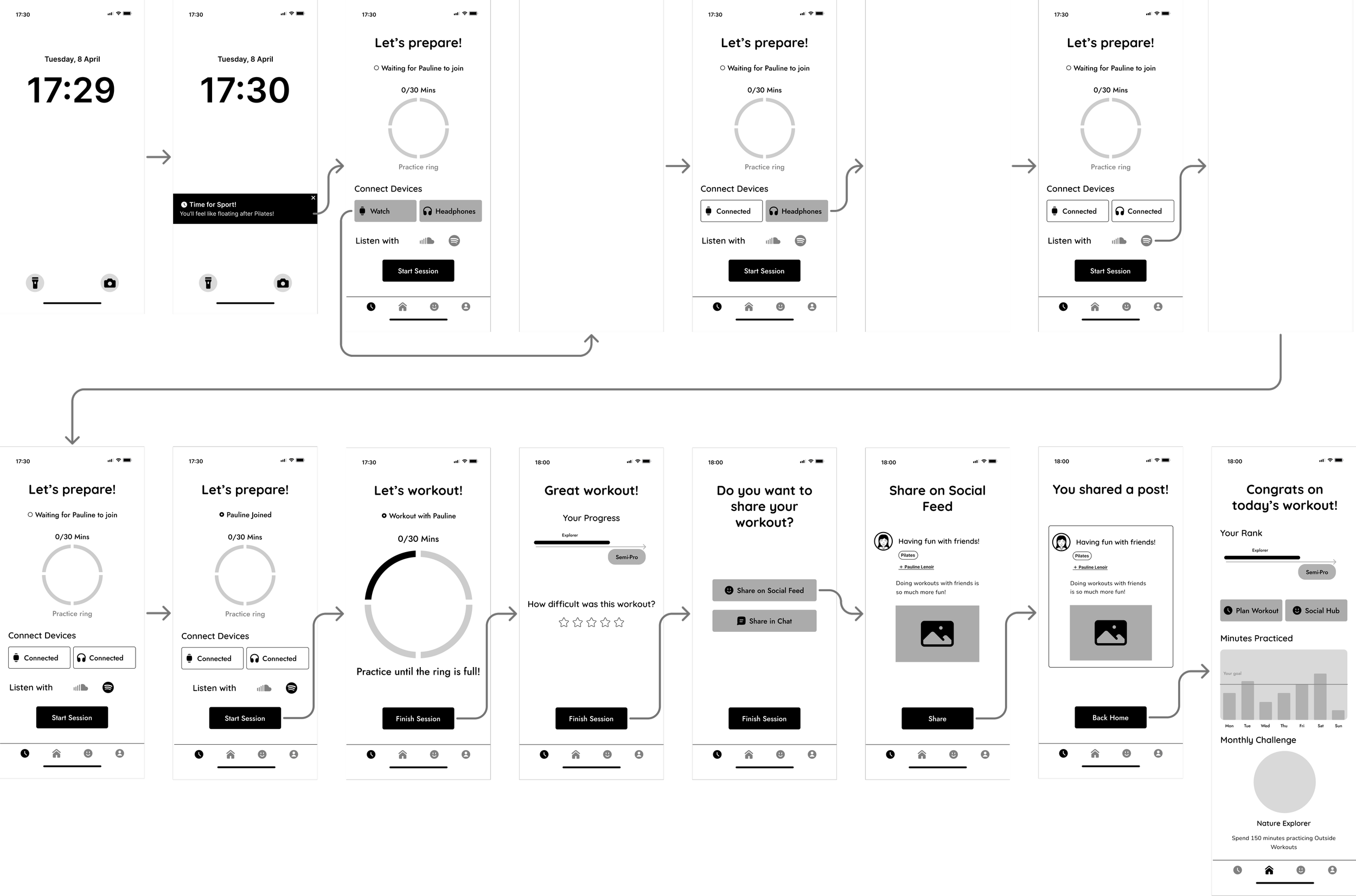
Continuing the ideas designed in the hand-drawn sketches, I created in Figma the first iteration for the User flows of the app: Scheduling a Workout and Practicing a Workout. In order to have full flexibility on the changes from the following iterations, I chose to start with mid-fidelity wireframes and test them in this form before advancing to high-fidelity.
Scheduling a Workout
Practicing a Workout
Improving the features through User Testing
After designing the first iteration of the app, I organised a User Testing Session for the mid-fidelity version of the screens.
Users participating in the testing session: 5
Purpose: testing the general usability, understanding the mental models of the users regarding a sports app
Actions tested within the app: browse homepage | schedule a workout | practice the scheduled workout with a friend
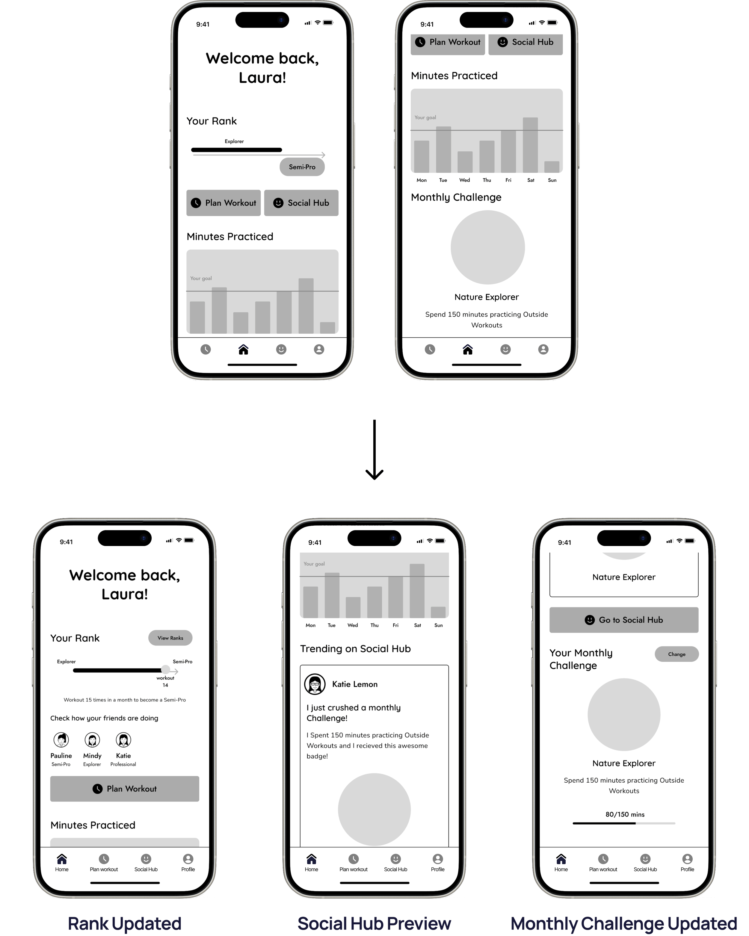
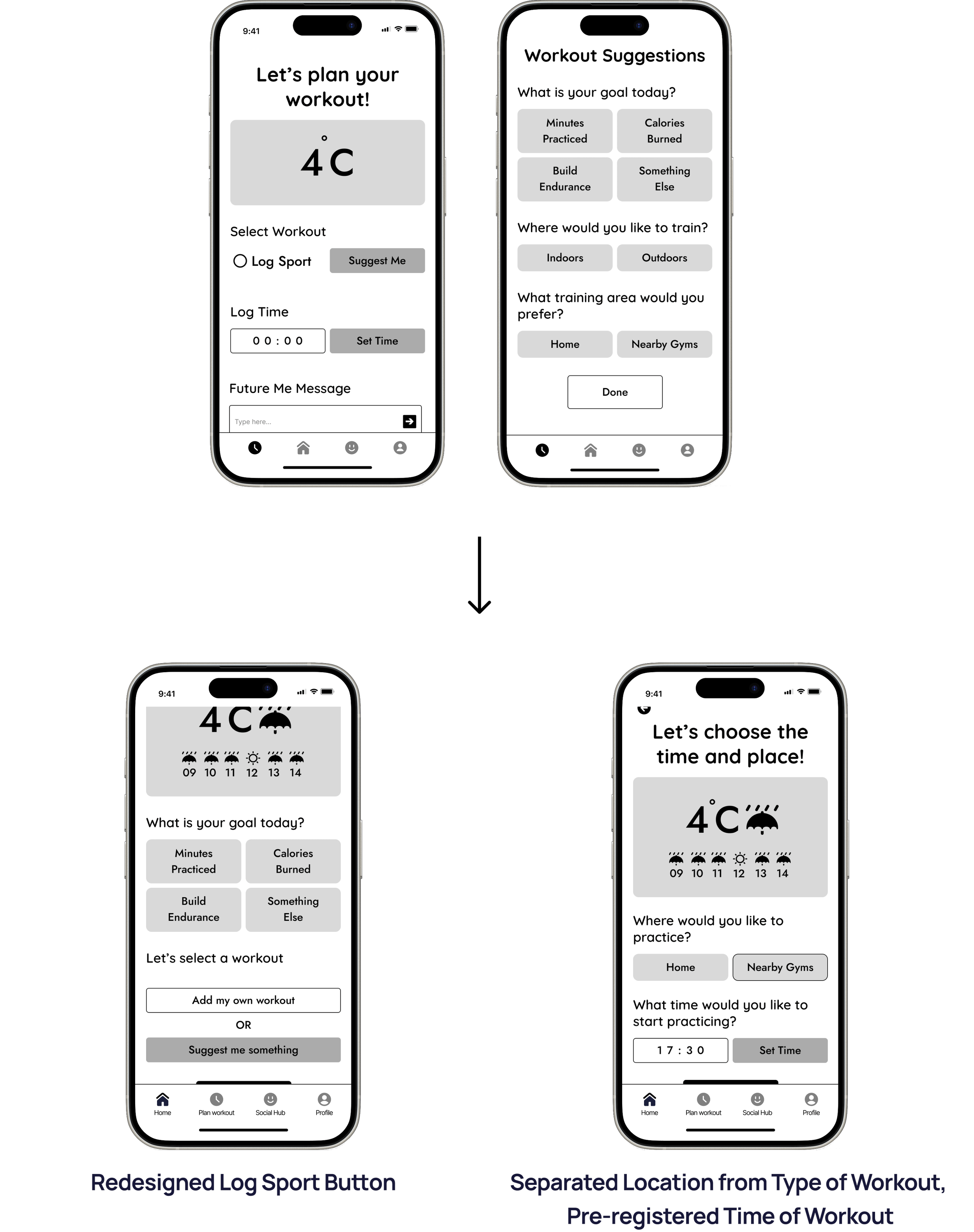
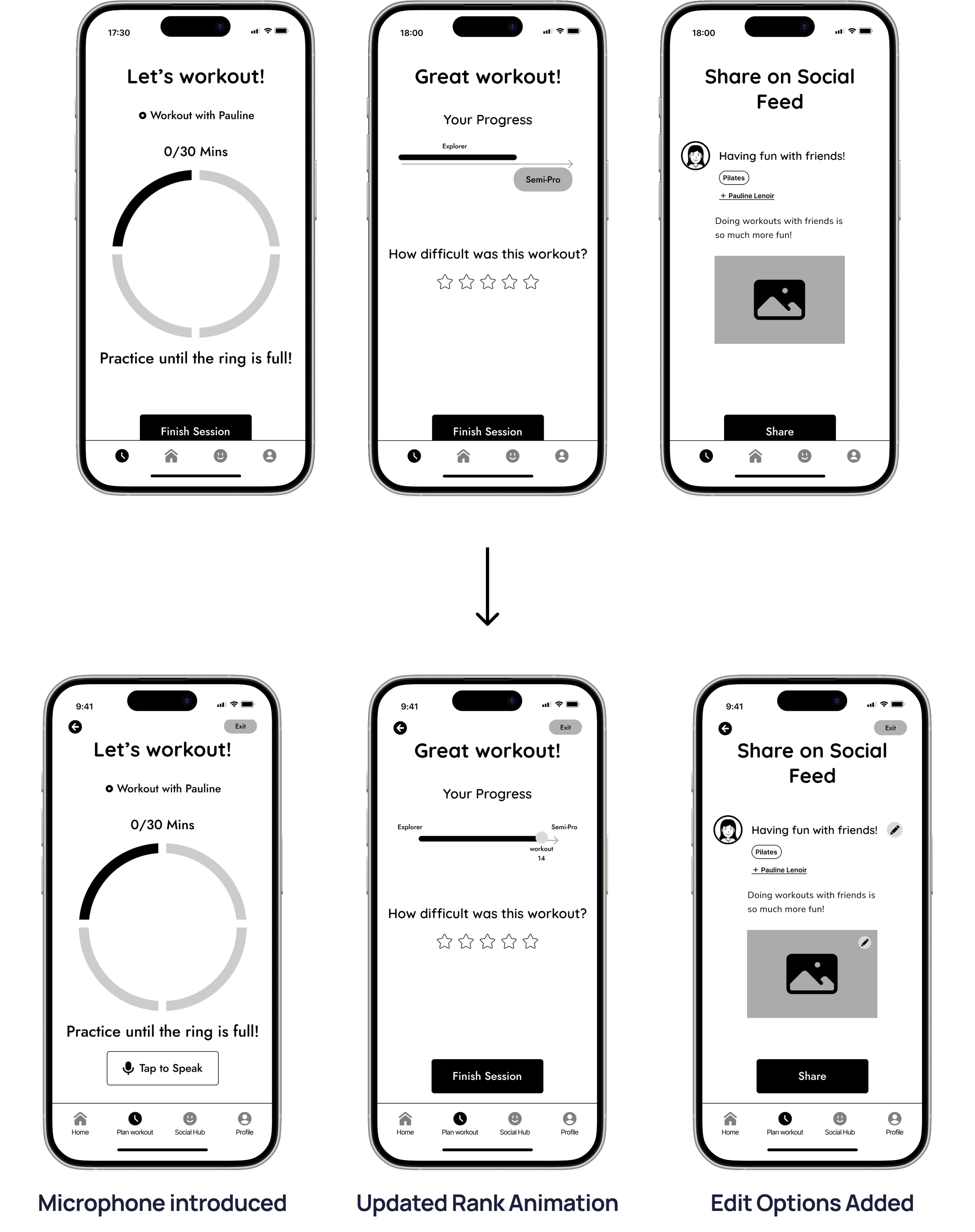
The general impression was that the app was helpful and intuitive. Some of the most appreciated features were: the Future Me Message, the Friend Synced Workout, and the integrated Weather Widget.


From Insight to Interface: Prototyping the User Experience
After improving the features, I have elaborated the final mid-fidelity iteration upon which I built the high-fidelity version of the app.
Below you can find the mid-fidelity prototypes for the most important flows of the app: Scheduling a Workout and Practicing a workout with a friend.
Exploring the message of the app through the Mood Board
The first step towards creating the high-fidelity version of the app was to compose a Mood Board. I included the following elements:
the general vibe that sports give,
examples from competitors,
colors, illustrations, and typography
I want the app to be perceived as a playful hub, where you get to experience the benefits of practicing sports and overcome the anxiety associated with the hindering factors.

Building the Design System starting from Colors and Typography
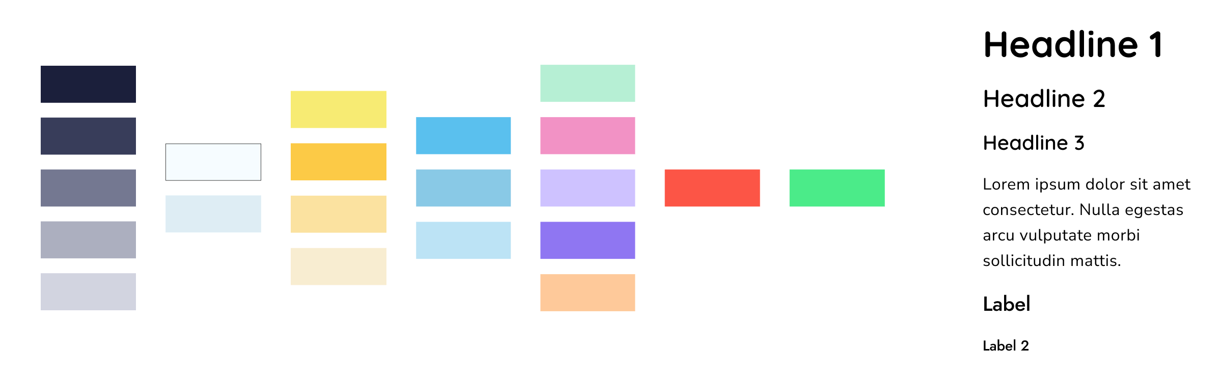
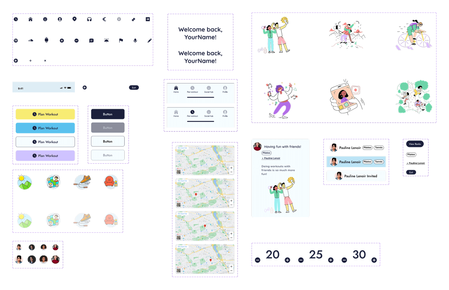
Creating Consistency through the Component Library
In order to maintain consistency, secure a future expansion of the design of the app, and make a fast, seamless process, I created a component library. Based on the Atomic Design principles, I focused first on designing key atom-level elements: icons, buttons, illustrations, and text . Based on these, I composed bigger elements, on a cellular and organic level: navigation, headers, top bars, profiles, posts blocks, profile cards.
The icon library was composed with the help of the Ultimate Bold and Flex Bold icon libraries found on the Streamline Icons plug-in. The illustrations used were borrowed from the UX Color and Barcelona sets from the same plug-in.
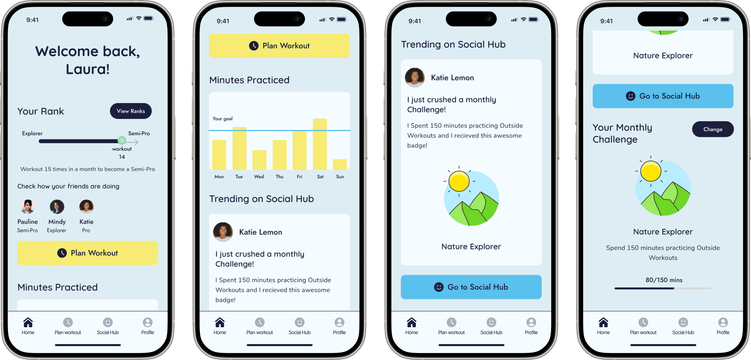
Exploring realistic user navigation with the High-Fidelity Iteration
HomePage
Schedule Panel
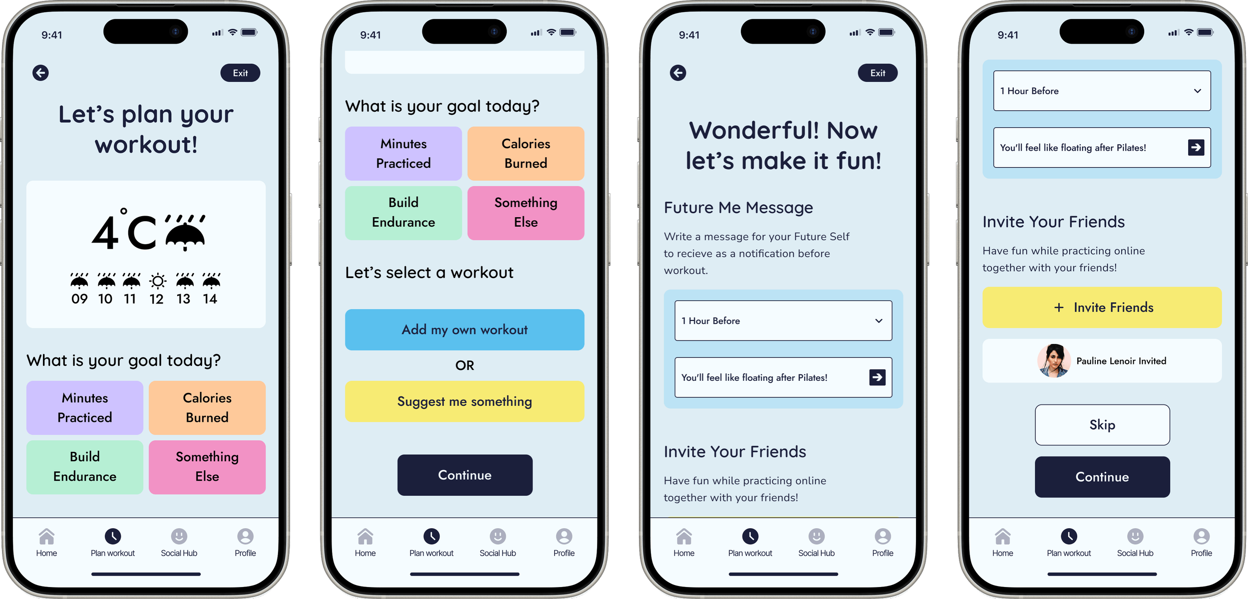
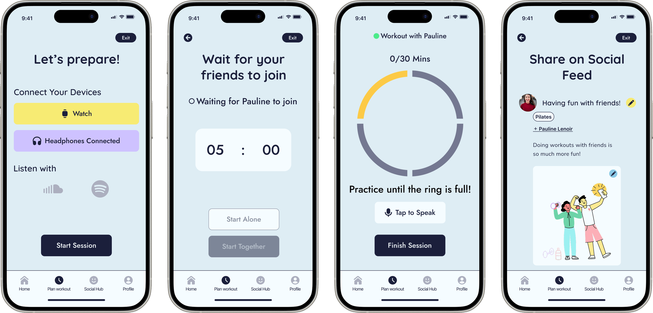
Practice Workout Panel
The Final Look
Getting a glimpse of real-life usage with Prototypes
The final look of the app encompasses a helpful tool that can help users overcome real-life challenges and practice sports consistently.
My personal reflection on the process
Regardless of the designer’s vision, the users have the best input, because they are the ones who experience the app at its full potential. Therefore, user testing is crucial for creating high-quality products. It’s the step that has really pushed my creativity and vision and helped me improve the most.
Having the courage to reiterate and change my vision unlocked a completely new, better set of ideas.
Check out my other projects!


Responsive Website Redesign after NGO rebranding

Designing a Logo based on Personal Branding

Creating the Visual Design for a Luggage Track App